Google just launched A2UI 1.0 - the stable, framework-agnostic open standard for generative UI!
We’ve worked closely with Google’s A2UI team since the initial release to bring best-in-class generative UI that’s safe to use in production. A2UI natively travels over AG-UI (Agent-User Interaction Protocol), so any AG-UI agent can use A2UI 1.0 without any custom integration.
A2UI 1.0 adds major upgrades for agent-driven interfaces. One screen can now combine your design system with any other component library, and the protocol enforces your design rules. The UI and the agent can also call each other’s functions directly, with richer validation on top.
Our new Generative UI in CopilotKit is built on this release, and it’s the best way to adopt A2UI. It comes with a standard catalog of 70 ready-made components.
In this post, we’ll cover how A2UI solves the generative UI problem, everything that’s new in 1.0, migrating from v0.9, and using it in CopilotKit.
A2UI (Agent to UI) gives agents a common language for UI. The agent describes what the user should see, and your app decides how it looks.
It starts with a catalog, the components your app already has. The agent picks from that catalog and replies with JSON that describes the interface. That JSON travels over any transport, like AG-UI or A2A, and your app renders it with your real components.
Frontend developers ship the building blocks once, and the agent composes them for every request. Here's what makes it work:
Without a standard, every library invents its own way for agents to describe UI. The output gets locked to one framework, rarely matches your product and is hard to trust. Teams end up rebuilding the same plumbing for every new agent and every new platform.
A2UI solves this with one open format for the whole ecosystem. Any agent can write it, any app renders it with its own components, and the work you put into your catalog carries across every agent and platform.
v0.9 made A2UI prompt-first, so models could write it reliably straight from the system prompt. 1.0 takes that foundation into production.
CopilotKit is the fastest way to adopt A2UI, with the agent connection, a ready-made catalog and debugging already built in.
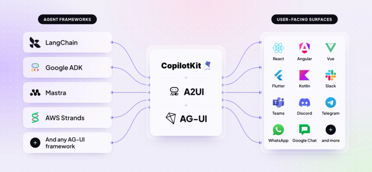
Because A2UI runs over AG-UI, the open protocol that connects agents to user-facing apps, you can use it with any AG-UI framework (LangChain, Mastra, Google ADK, etc) in just two lines of code.
You can also try the components yourself in the A2UI Playground, along with a ready-made prompt that adds A2UI to your app through your coding agent.
A2UI has finally reached 1.0. Let’s go through every change in detail. For the complete spec-level list, see the evolution guide.
This is the biggest upgrade in 1.0. Users get interfaces that respond in place, and developers get typed function calls between the UI and the agent.
In v0.9, anything the UI needed from the agent went out as an event, and the answer came back as a fresh response from the agent. In 1.0, the UI can call a function on the agent, like verifying a provider ID or checking inventory:
{
  "version": "1.0",
  "callAgentFunction": {
    "surfaceId": "contact_form_1",
    "functionCallId": "verify_provider_99",
    "callFunction": {
      "@call": "verifyProvider",
      "args": {
        "providerId": "PRV-102"
      }
    }
  }
}
The agent replies with the result, and it lands right in the component that made the call.
Components don’t care where a function runs. The same @call works in a validation check, a bound value, or a button action. If your app has the function, it runs locally. Otherwise, it goes to the agent.
It works the other way as well. The agent can call functions in the UI for things only the device knows, like the screen size. Your catalog decides which functions each side is allowed to call, and the renderer checks every call against it at runtime.
Real products rarely run on one component library. A dashboard might need basic layout components, your own design system and a partner’s map widget, all on the same screen.
In v0.9, each surface was locked to one catalog, so teams merged everything into one giant catalog or split the screen apart. In 1.0, each component can point to its own catalog, and the surface just sets the default.
Here, the title uses the surface’s default basic catalog, while the chart and the map name their own:
"components": [
  { "id": "title", "component": "Text", "text": "# Q3 sales" },
  {
    "id": "revenue",
    "component": "RevenueChart",
    "catalogId": "https://acme.com/catalogs/shadcn/1.0"
  },
  {
    "id": "stores",
    "component": "StoreMap",
    "catalogId": "https://maps.partner.com/catalog/1.0"
  }
]
Any catalog your renderer supports can be mixed this way, as long as they all target the same A2UI version. If a component’s catalog isn’t available, the renderer flags an error right away, so nothing quietly renders with the wrong library.
In 1.0, your catalog carries the rules of your design system, along with its components.
With composition rules, you declare which components go inside which. A menu item only belongs in a menu, and a page layout only sits at the top of a surface:
{
  "Menu": { "type": "object", "allowedChildren": ["MenuItem"] },
  "MenuItem": { "type": "object", "allowedParents": ["Menu"] },
  "AppLayout": { "type": "object", "allowedParents": ["Surface"] }
}
If the model puts a component somewhere it doesn’t belong, it gets an error naming the exact rule it broke, so it can correct itself.
Catalogs are also more self-contained. Usage instructions for the model, which used to sit in a separate rules file, now live inside the catalog, and shared design tokens like colors are defined once. When your design system retires a component or prop, you can mark it deprecated with a note on what to use instead.
In v0.9, showing anything took three messages: create the surface, add the components, then send the data. In 1.0, createSurface can carry all of it:
{
  "version": "1.0",
  "createSurface": {
    "surfaceId": "user_profile_card",
    "catalogId": "https://a2ui.org/specification/v1_0/catalogs/basic/catalog.json",
    "components": [
      { "id": "root", "component": "Column", "children": ["user_name"] },
      { "id": "user_name", "component": "Text", "text": { "@path": "/name" } }
    ],
    "dataModel": { "name": "John Doe" }
  }
}
Simple UIs appear the moment this message lands, and the model has one complete object to get right instead of three messages in the right order.
It’s easier to debug too, since the full UI sits in one message you can log, read and replay. Larger UIs can still stream in piece by piece.
In v0.9, a check could only pass or fail, with one fixed message. In 1.0, a check returns a validation result with its own code, message and severity:
{
  "valid": false,
  "code": "EXPIRED_CARD",
  "message": "The card expiration date (05/24) has passed.",
  "severity": "error"
}
Severity can be error, warning, or info, so a form can show a gentle hint as well as a hard error. A result can also include your own fields, like a suggested fix the UI can offer.
And because the UI can now call your agent, the check itself can run there, against live data your app doesn’t hold.
In 1.0, functions with side effects (like opening a link or copying data) can require a real user action before they run. Without this, a function like openUrl could fire the moment a UI rendered and send users somewhere they never chose to go.
A catalog marks these functions with requiresUserActivation:
"openUrl": {
  "returnType": "void",
  "requiresUserActivation": true,
  ...
}
The renderer only runs them from user actions, such as clicking a confirmation button. Anywhere else, like during rendering or inside a bound value, they’re blocked.
In 1.0, accessibility is part of the spec, so agent-generated UI works with screen readers by default.
Every renderer must map labels and descriptions to the platform’s accessibility APIs, like ARIA on the web or Semantics in Flutter. When you don’t set a label, the renderer infers one from visible text, so a Submit button is announced as “Submit”.
Components can also announce their own changes. A status line that updates while the agent works can read each new update aloud to screen reader users:
{
  "id": "status",
  "component": "Text",
  "text": { "@path": "/status" },
  "accessibility": { "live": "polite" } // or "assertive", "off"
}In 1.0, A2UI reserves the @ prefix for its own instructions. Bindings that read from your data and calls that run a function now start with it:
// v0.9
{ "id": "name", "component": "Text", "text": { "path": "/user/name" } }

// 1.0
{ "id": "name", "component": "Text", "text": { "@path": "/user/name" } }
It keeps your data and A2UI’s instructions cleanly apart. In v0.9, if your data happened to contain a path or call field, like a file record or a call log, the renderer could treat it as a binding. Now anything starting with @ is an instruction, and everything else is just your data.
In 1.0, you can attach your own metadata to A2UI messages without forking the spec.
A2UI 1.0 schemas are strict and reject unknown fields, which keeps every payload easy to validate. Extensions give your extras an approved home on catalogs, surfaces, components and user actions:
"metadata": {
  "extensions": {
    "com_acme_audit": { "sessionId": "abc-123" }
  }
}
Keys are namespaced, like com_acme_audit, so they never clash with official A2UI extensions. Renderers ignore keys they don’t recognize, so your metadata never breaks someone else’s renderer. Teams can use this for access policies, audit signatures, or telemetry IDs.
1.0 is a breaking release, but most of the migration is mechanical, like updating the version string and switching bindings to @path.
v0.9 and 1.0 surfaces can run side by side, so you can move one surface at a time. The evolution guide walks through every change.
CopilotKit’s new Generative UI speaks A2UI 1.0 under the hood, so you can build on it with your agent today. You can start with the standard catalog, which comes with 70 ready-made components, including all 18 A2UI basic components.
Install CopilotKit in your app:
npm install @copilotkit/react-core @copilotkit/runtimeThen add the standard catalog to your CopilotKitProvider:
import { standardUI } from "@copilotkit/react-core/v2/generative-ui";

<CopilotKitProvider runtimeUrl="/api/copilotkit" generativeUI={{ ui: standardUI }}>
To use your own components, register them with createGenerativeUI. Each one gets a description that tells the agent when to use it, plus typed props, and extends keeps the standard catalog alongside yours.
export const shopUI = createGenerativeUI({
  id: "acme/shop@1",
  extends: [standardUI],
  components: {
    ProductCard: {
      component: ProductCard,
      description: "One product. Copy every value from a product in a tool result.",
      props: z.object({ name: z.string(), price: z.number(), imageUrl: z.string() }),
    },
  },
});
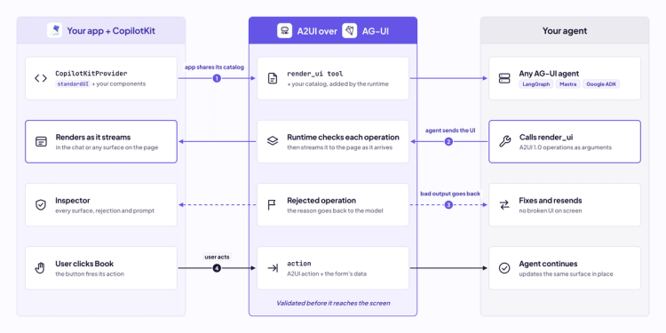
Here's what happens from the moment your app shares its catalog to the agent's next update!
We also shipped surfaces, which let the agent generate UI outside the chat, anywhere on your page you mark as a surface. With markdown mode, the agent writes A2UI blocks straight into its reply, so text and UI stream together.
When something looks off, the Inspector shows every rendered surface, any rejected output with the reason, and the exact prompt the model received.
If you already use A2UI v0.9 with CopilotKit, nothing breaks. Read the docs and the launch blog for everything that shipped.
A2UI 1.0 is the stable, framework-agnostic open standard for generative UI. With CopilotKit, you can build on it today using your own components, on any user-facing surface. We can’t wait to see what you build with it.
To learn more:
Follow CopilotKit on Twitter for updates. If you get stuck, reach out in the CopilotKit or AG-UI communities.
Subscribe to our blog and get updates on CopilotKit in your inbox.



